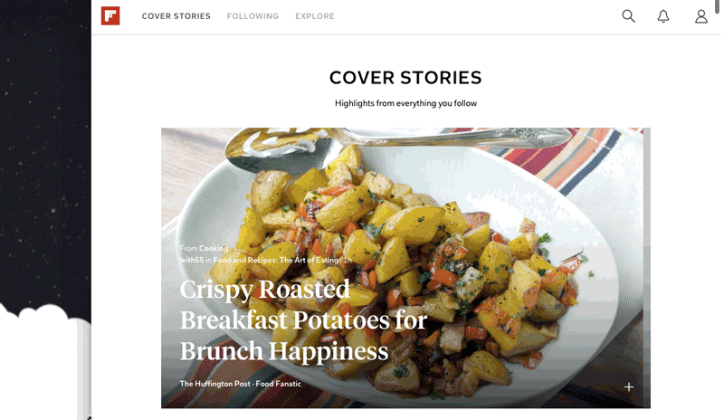
We smile when we think of 2015 as the year of our Web launch, but it’s here: a beautiful version of Flipboard for the desktop and a major new frontier on our quest to build the world’s best personal magazine. By developing for mobile first (Flipboard was originally built for the iPad in 2010), we saw that content could shine again in a clean and uncluttered environment. The Web evolved, too, with things like responsive design making for easier (and prettier) reading and navigation. The vision of our founders—to bring a print-like aesthetic to digital content—could finally be realized. You’ll see that Flipboard.com has its own look and feel. As with developing for iPhone, Android and Windows, the team builds on a platform’s unique attributes while still retaining the heart and soul of Flipboard. For example, Flipboard on the Web has responsive layouts for different screen sizes…
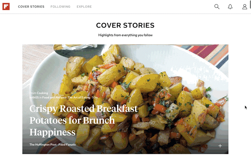 and interactions triggered by your mouse…
 To create optimal layouts and a pacing that feels natural for Web browsing, we compute the relevancy of stories and photos and analyze the type of content—such as images or text—that’s on a page. We also algorithmically recommend topics and magazines you might like (based on your interests) in modules throughout the site. And if you log in to your account on the Web, everything you do to personalize your Flipboard will show up on your phone or tablet, and vice versa.
With Flipboard everywhere, millions more people can experience it for the first time while current readers can catch up on the news they care about and collect stories into magazines anytime, anywhere. Hear more from the team and let us know what you think!
~The Flipboard Team
@flipboard
/flipboard
+flipboard
To create optimal layouts and a pacing that feels natural for Web browsing, we compute the relevancy of stories and photos and analyze the type of content—such as images or text—that’s on a page. We also algorithmically recommend topics and magazines you might like (based on your interests) in modules throughout the site. And if you log in to your account on the Web, everything you do to personalize your Flipboard will show up on your phone or tablet, and vice versa.
With Flipboard everywhere, millions more people can experience it for the first time while current readers can catch up on the news they care about and collect stories into magazines anytime, anywhere. Hear more from the team and let us know what you think!
~The Flipboard Team
@flipboard
/flipboard
+flipboard